Designing real-time support for people in vulnerable moments
Opening
Finding help in a moment of need should not depend on whether you feel safe walking into a building.
Streetlives connects people experiencing homelessness with local resources. Today, that support mostly happens in person through shelters and outreach sites.
But not everyone can get there. And not everyone wants to.
This project explored how to bring that support online without losing the speed, trust, and care that make it work in real life.
Context
Streetlives builds tools with, not for, people who have experienced homelessness.
Through YourPeer, their peer-powered platform, users can find services, understand eligibility, and navigate complex systems with support from Peer Navigators, people with lived experience.
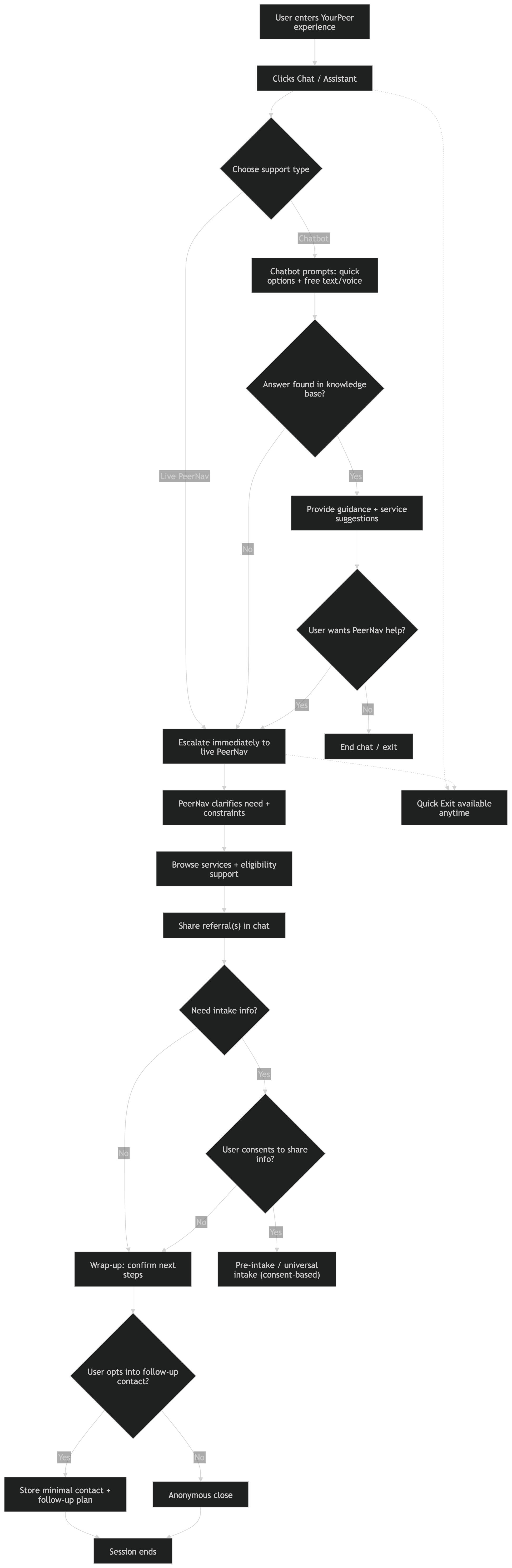
The opportunity was to extend that model into a web-based chat and voice interface, making support accessible beyond physical locations.
The Real Problem
Peer Navigators provide high-quality, human support, but only in physical spaces.
That creates a clear gap. People who cannot travel are excluded. People who do not feel safe in shelters opt out entirely. Support becomes dependent on access, not need.
Moving this system online introduces a harder design challenge. How do you design for speed, accessibility, and safety at the same time?
Core Tension
This project was shaped by competing priorities. Speed, because users need help quickly and often in urgent situations. Trust, because conversations must feel human and supportive. Accessibility, because users may have limited time, data, or stability. Safety, because sensitive topics require care, boundaries, and consent.
Improving one often meant compromising another. My job was to navigate those tradeoffs, especially where design decisions directly affected how support would be delivered.
My Role
I focused on designing the core experience for both sides of the interaction.
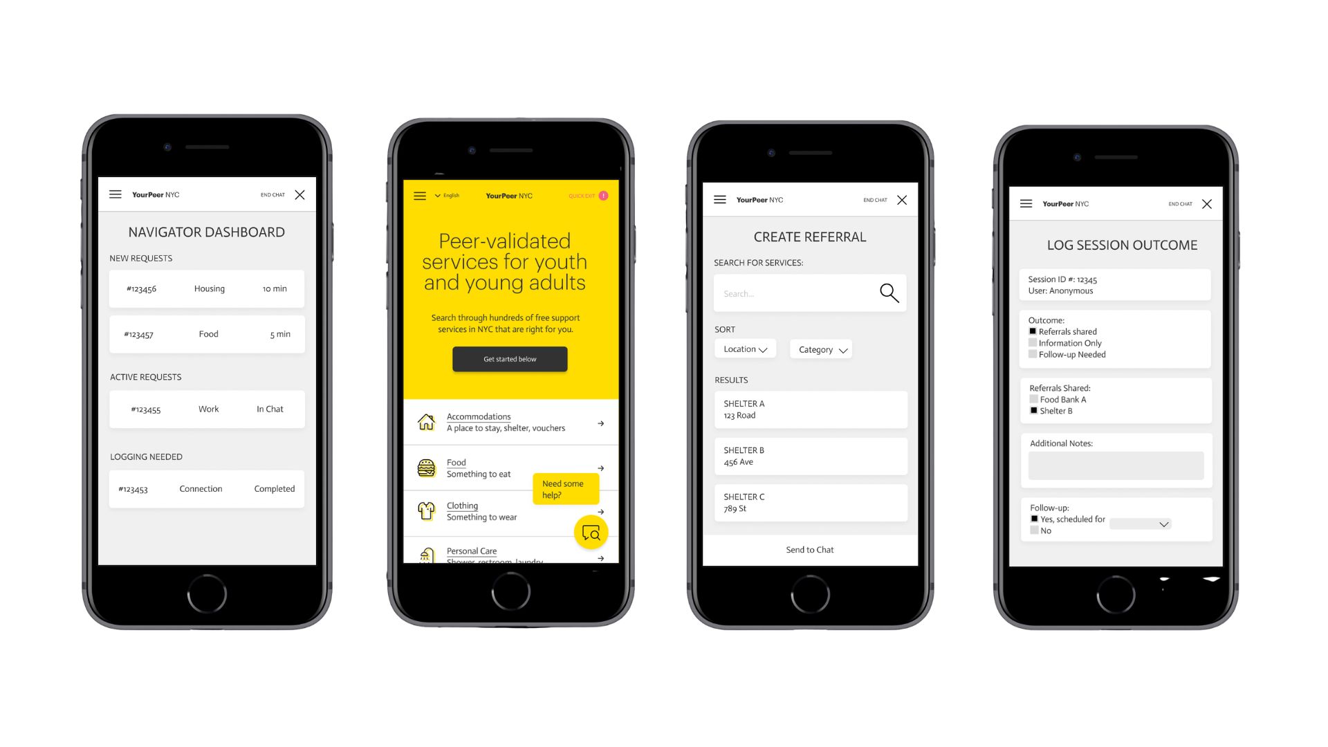
Chat interface on the user side. Navigator dashboard and workflow. Safety features, including a quick exit mechanism. End-to-end user flows.
I worked closely with engineers and ethics stakeholders in real time, shaping solutions as technical and ethical constraints surfaced.
Designing with Real-World Constraints
This project required working under constraints that were not just technical, they were ethical.
We could not realistically or responsibly conduct traditional user testing with people experiencing homelessness within a semester timeline.
Instead, we tested navigator and supervisor tools with Streetlives-provided participants, relied on stakeholder input and domain expertise, and grounded decisions in lived experience insights from the organization.
That meant designing with incomplete but meaningful information, rather than forcing ideal conditions.
Personal Context
Outside this project, I have volunteered at a local shelter.
I have seen how quickly needs can escalate, people looking for food, water, or a place to rest. I have also seen how easily people disengage if help takes too long.
That shaped how I approached this work. Speed was not just a usability metric. It was about whether someone would stay long enough to receive help at all.
Key Decision: Speed vs Quality of Care
One of the hardest problems was designing for responsiveness without reducing care.
If navigators moved too slowly, users might leave before receiving help. If they moved too quickly, support could feel transactional or incomplete.
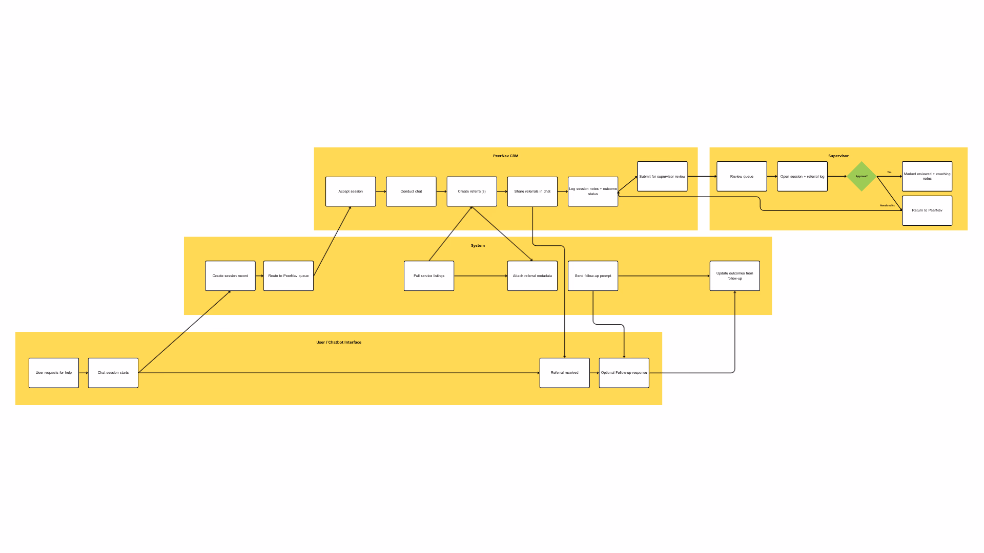
I focused on designing a navigator dashboard that surfaces requests clearly and quickly, reduces friction in responding to users, ensures no request gets lost or delayed, and supports navigators balancing multiple conversations.
The goal was not just efficiency. It was making sure no one was unintentionally ignored.
Collaborating with Engineering + Ethics
This was the first T4SG project with engineering, UX, and ethics working together from the start.
Instead of designing in isolation, we worked in parallel. Engineers gave immediate feedback on feasibility. Ethics stakeholders challenged assumptions around safety and consent. Design evolved in response to both.
This sped up iteration, but more importantly, it changed how decisions were made. Design became a negotiation between what we could build, what we should build, and what users actually needed.
Design Solution
User chat interface
A simple, low-friction entry point with clear conversation flow and accessible interaction patterns.
Navigator dashboard
Real-time session management with visibility into user needs and tools to respond quickly.
Safety features
Quick exit functionality, support for sensitive topics, and clearer boundaries for interaction.
Impact
Expanded access to peer support beyond physical locations. Reduced reliance on in-person services. Created a scalable model for real-time support. Balanced speed and care in a high-stakes context.
Reflection
This project changed how I think about design.
It pushed me to consider not just usability, but responsibility, what it means to design systems people rely on in vulnerable moments.
I learned how to work through uncertainty, collaborate across disciplines, and make decisions where there is not a perfect answer. Most importantly, I learned design is not neutral. The way we structure interaction can shape whether someone gets support in time.