RFCx wanted their consumer app to feel worthy of the work they do in the field. When we started, nobody could quite agree what that app was for. My job was to help turn that fog into a direction we could actually design against.
Context
Rainforest Connection runs acoustic listening networks so threatened places get heard before they disappear. They are a nonprofit with serious science behind them and partners who live next to the forests they protect.
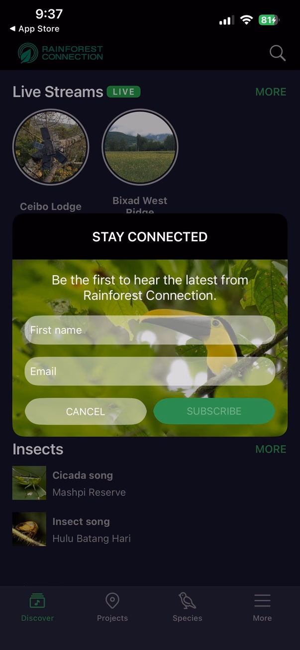
Their existing mobile app let you tune into live streams from the canopy. People loved the idea. In reality the experience broke often, stopped at passive listening, and felt miles away from the depth of RFCx's story. You left the app without understanding why the organization mattered.
Problem
There was no crisp product brief waiting on a slide deck. Stakeholders each carried a different mental model of where this app should land next. Inside RFCx the scope kept shifting because nobody had locked the North Star.
On top of that, the build itself struggled. Streams failed. Features stayed thin. None of it reflected how expansive RFCx's work really is. Early chats with the CMO and the technical side helped me name what bothered me. Yes the UX needed care. The harder gap was clarity. What is this app for, and why should someone keep it on their phone?
How might we turn a fragile listening tool into a platform that connects people to RFCx's mission through discovery, learning, and real ways to engage?
Constraints
Product
- Android first because that is where users actually live
- Low bandwidth and uneven connectivity in the geographies we care about
- Moments where offline behavior had to feel honest, not pretend perfect
Research
I never pretended we could fly somewhere for a perfect round of field interviews on a semester clock. That access was not there. Rushing communities into a UX lab would have been worse than incomplete data. I leaned on RFCx staff, partner voices, secondary research, and long threads about what we could honestly claim on screen.
What showed up in the UI
Those realities pushed me toward layouts that stay calm when the network drops, loading states that feel truthful, and flows you can follow without a manual.
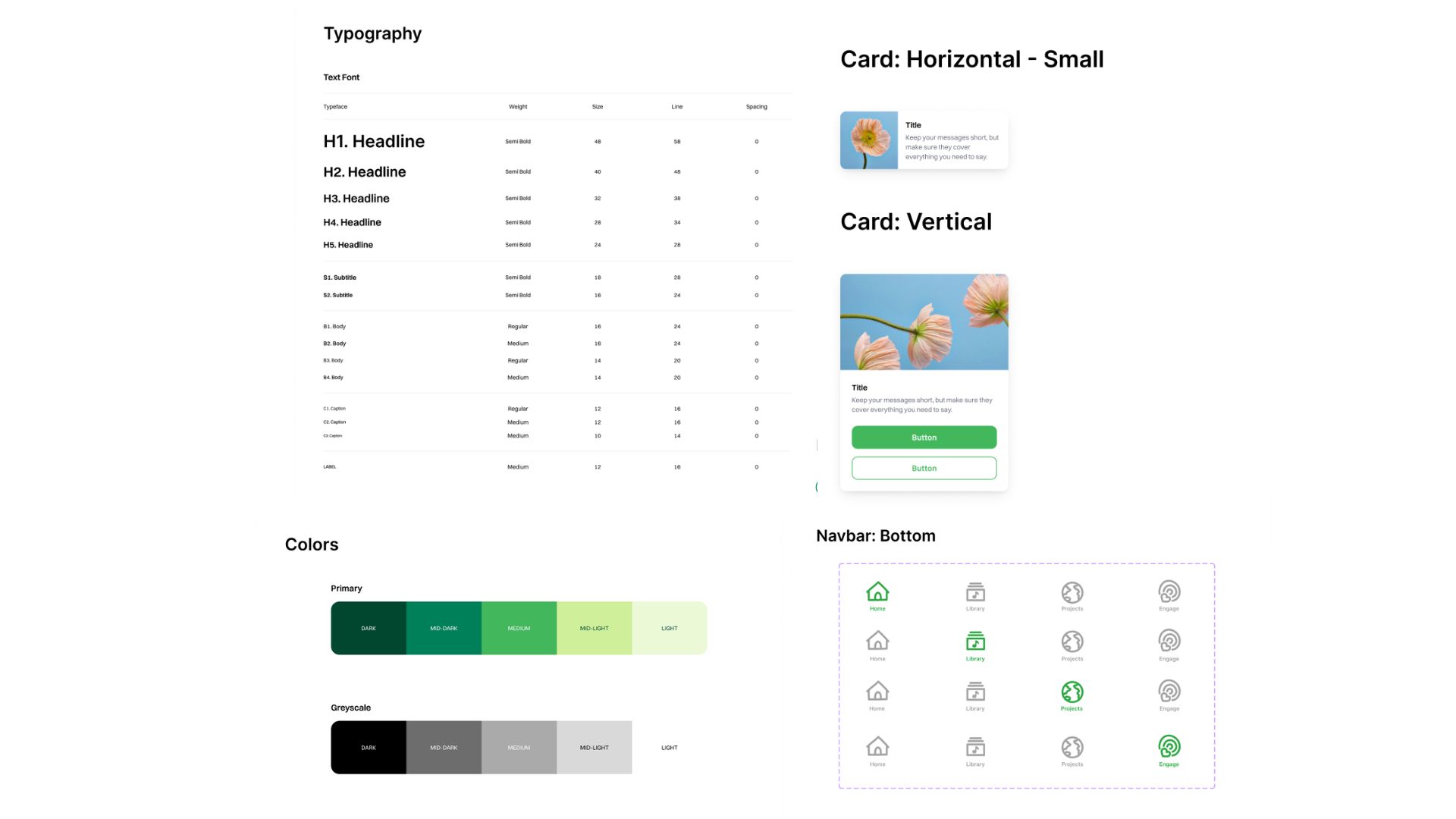
Early lo-fi explorations from weekly client working sessions
Process
Finding the product direction
Because the brief stayed soft, I treated weekly client syncs like working sessions. We talked in circles until the circle got smaller. Slowly the picture shifted from a novelty listening toy toward an ecosystem that could carry RFCx's voice the same way their site and programs try to.
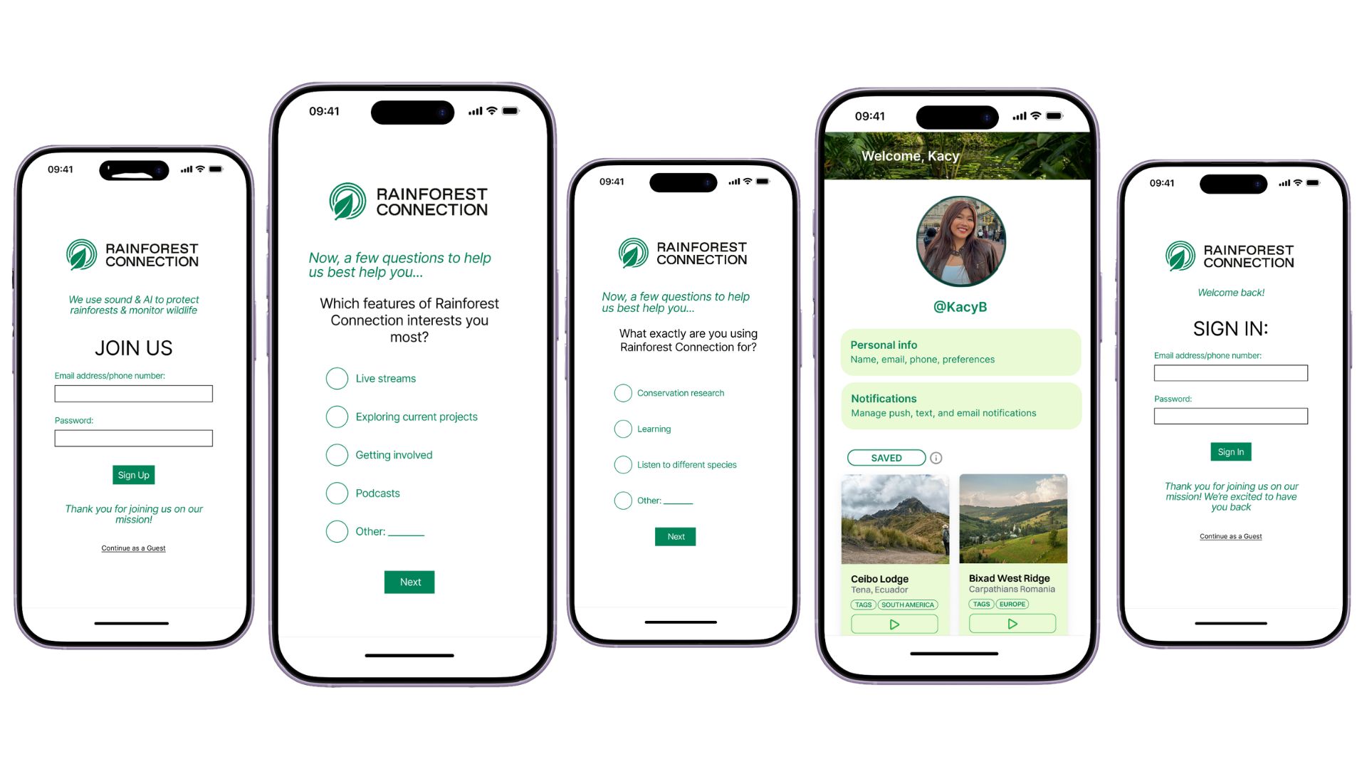
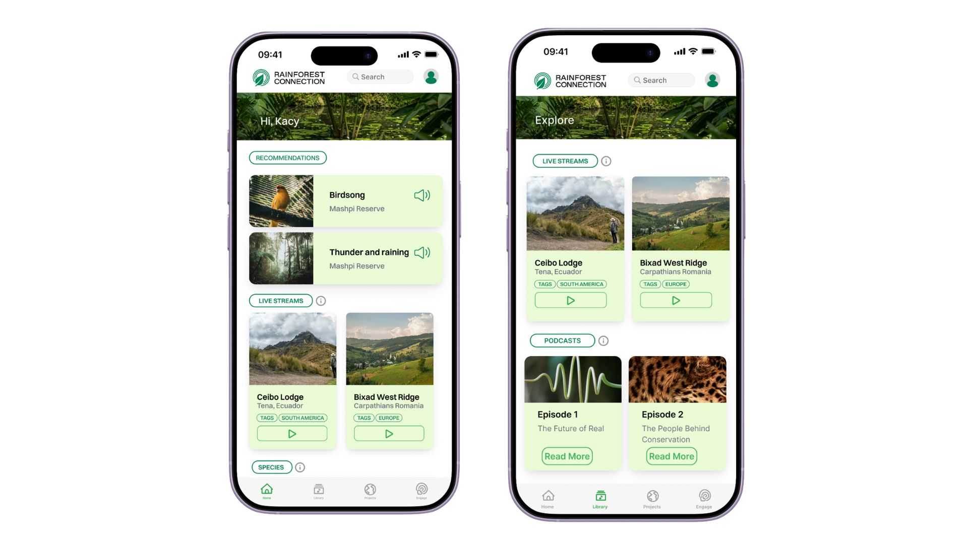
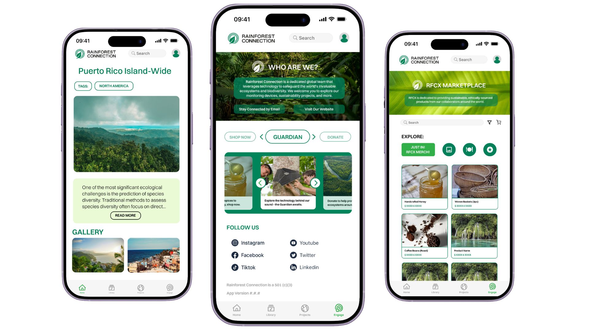
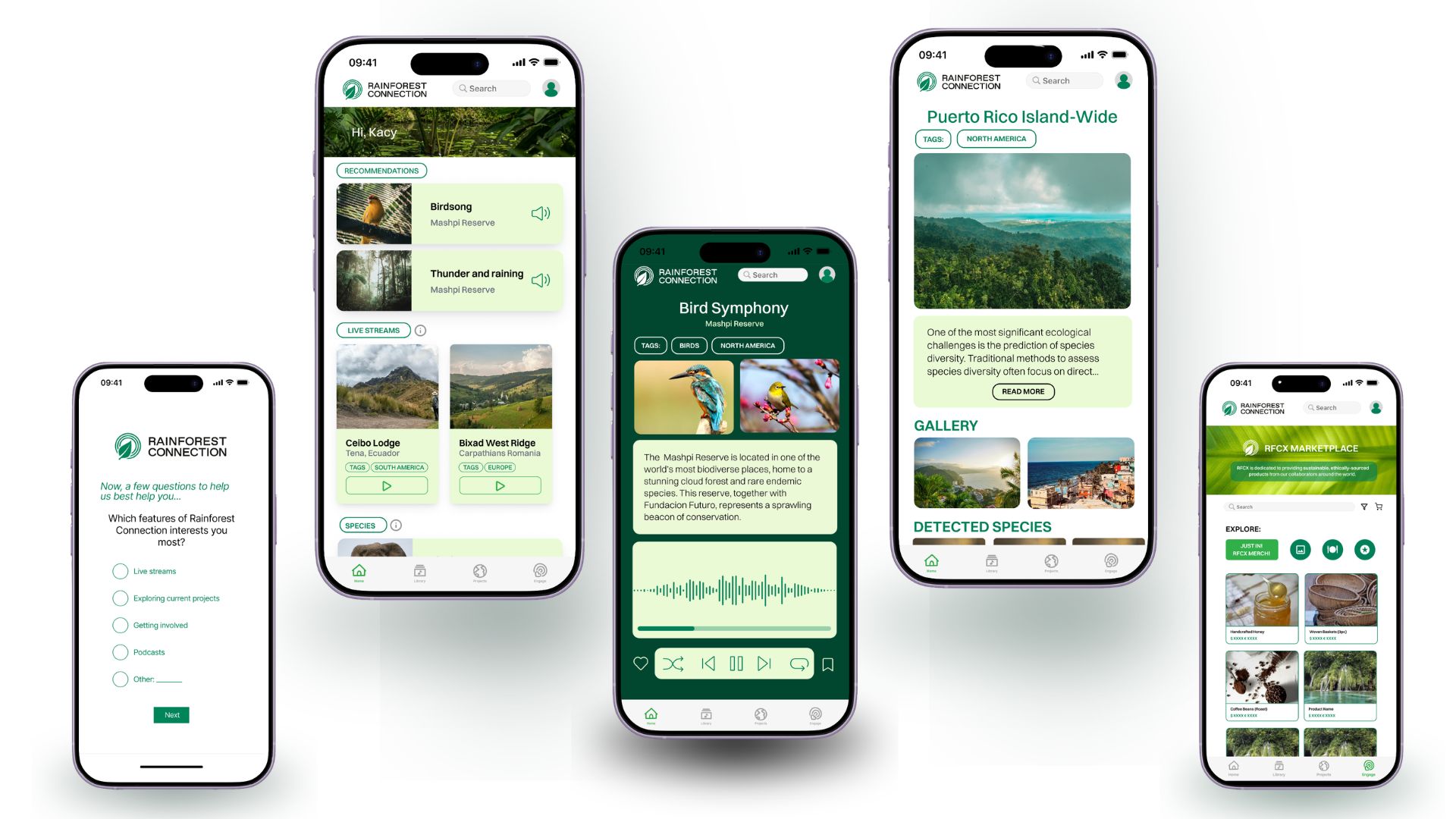
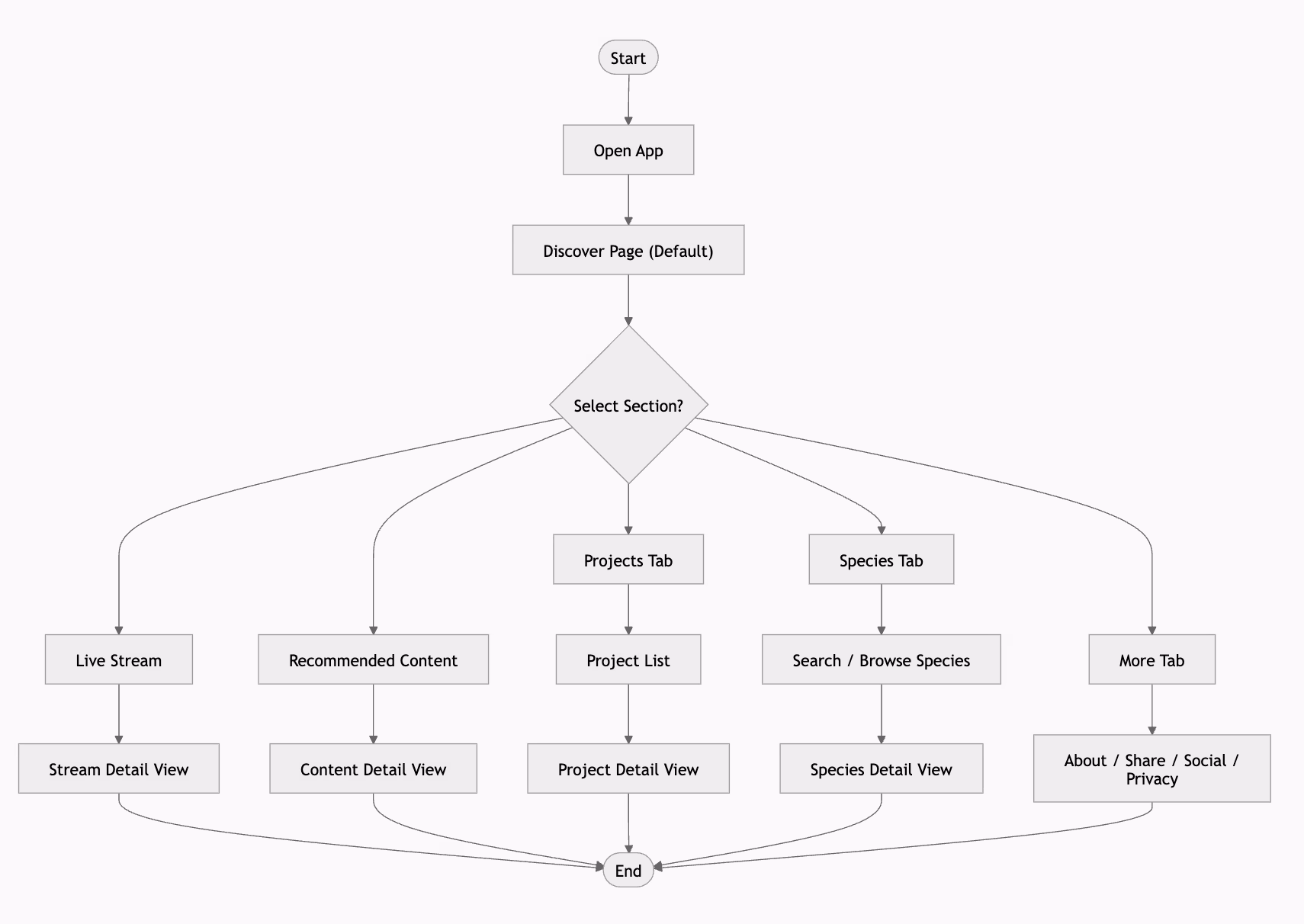
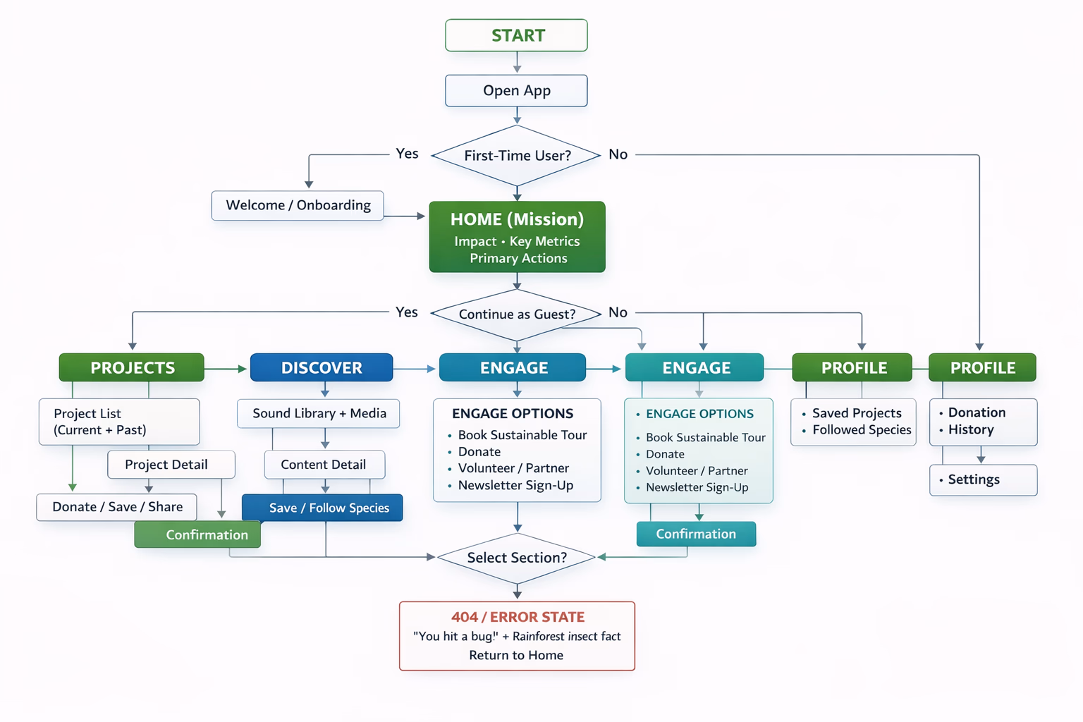
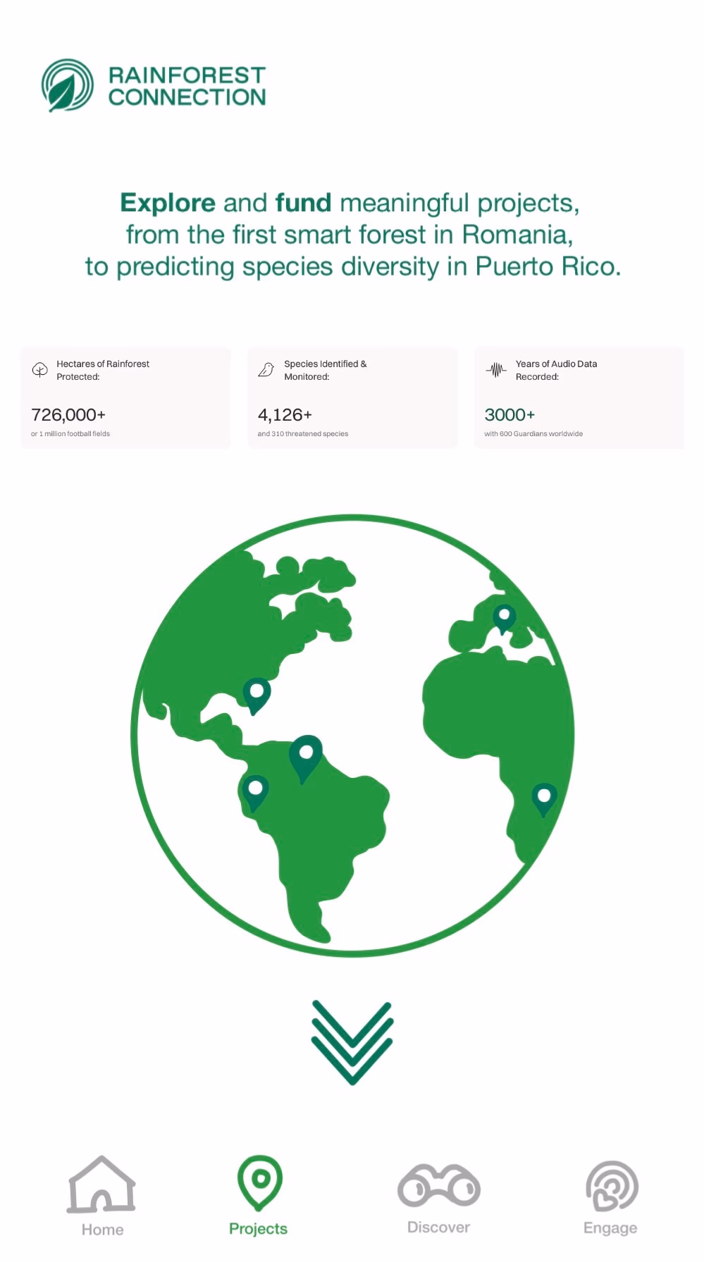
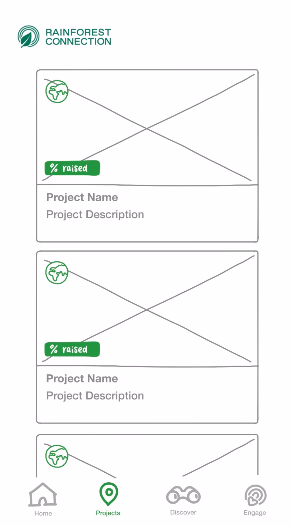
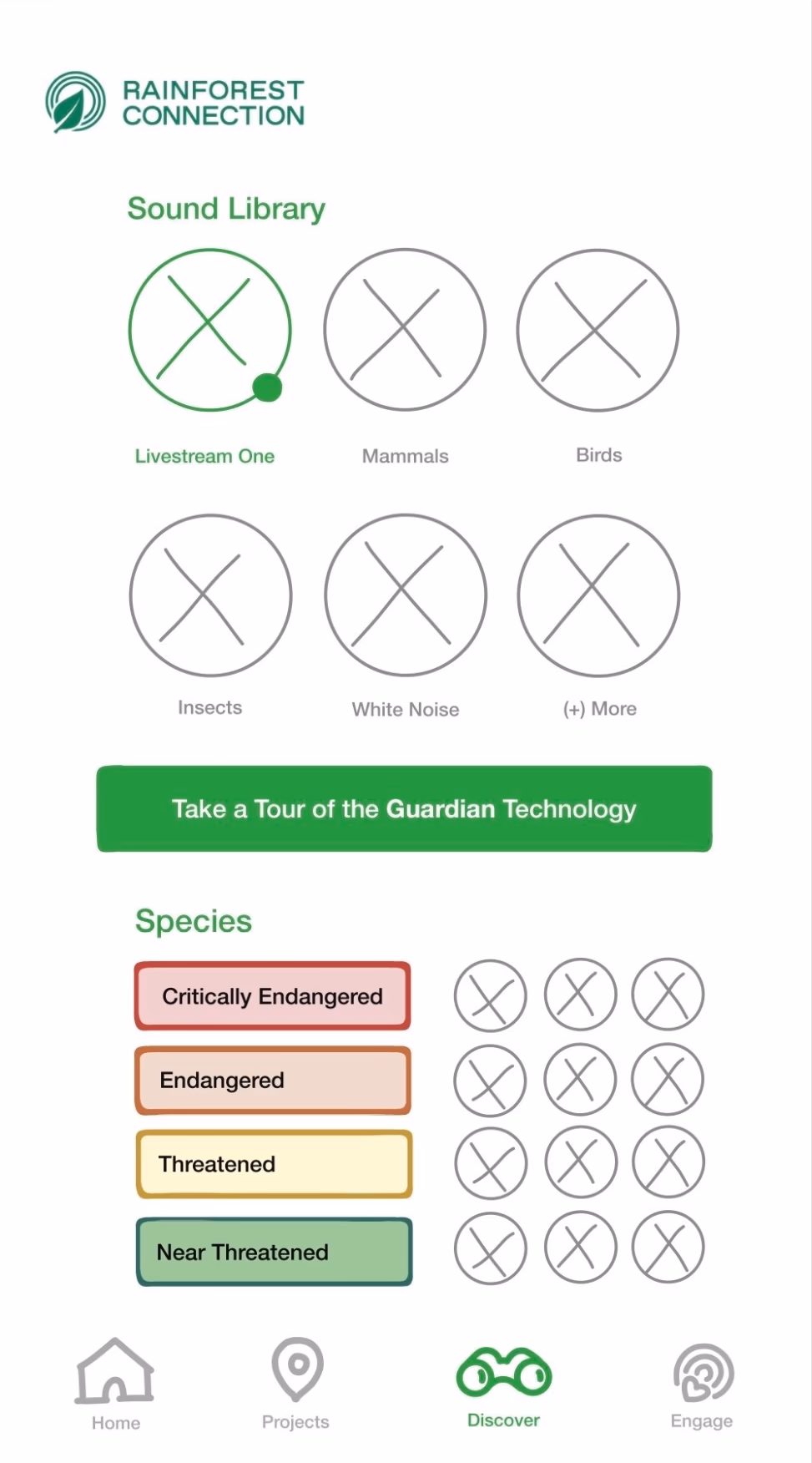
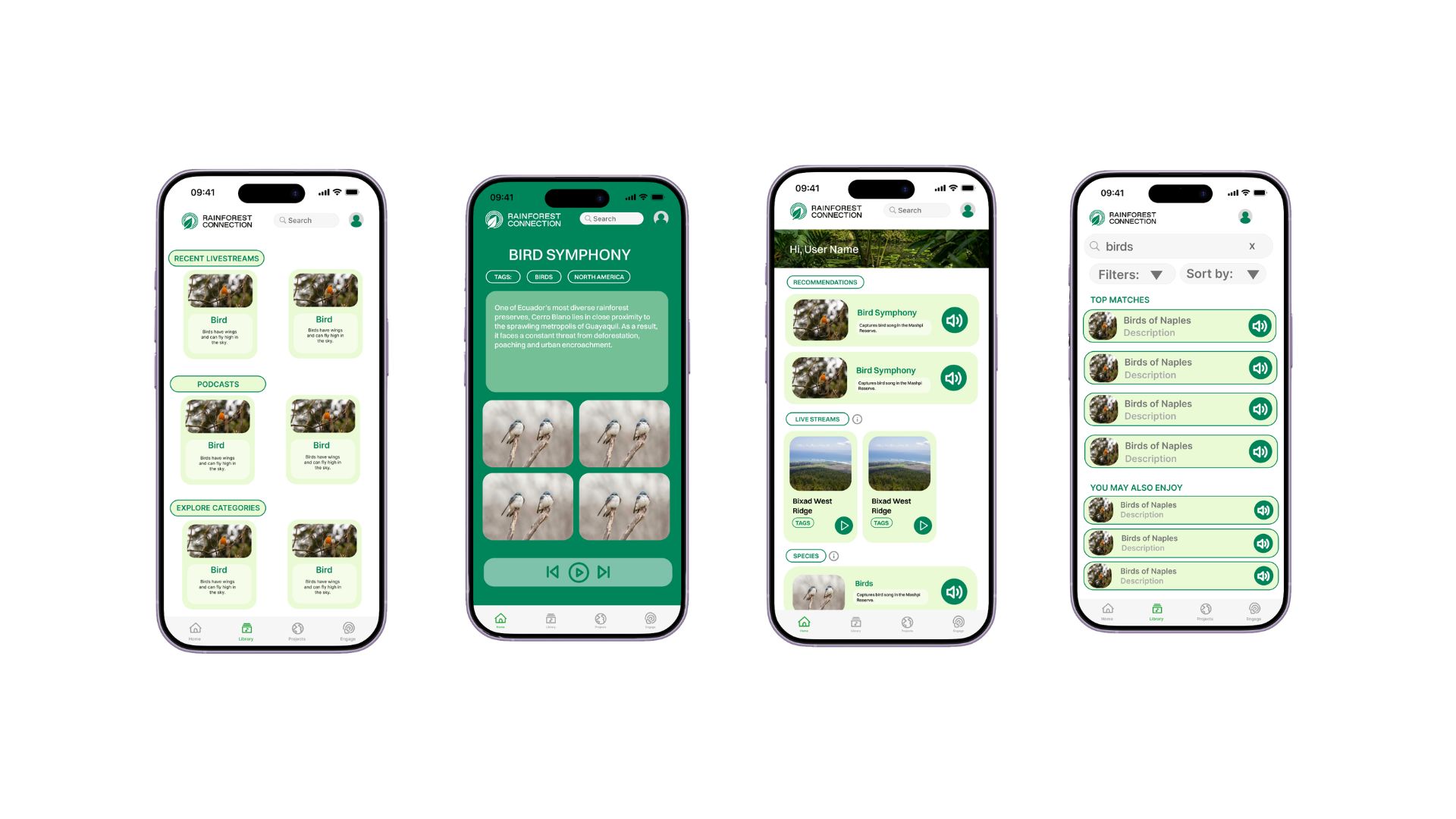
The frame I kept returning to had four homes for content and action. Home, which we treated as mission central with onboarding, personalization, and the numbers and stories that prove impact. Library for live audio plus the podcast layer that arrived mid project. Projects for conservation stories and a clearer read on where funding lands. Engage for eco tours and the marketplace lift for Indigenous sellers the founder cared about. My intent was simple. Help someone move from noticing RFCx to caring, then to doing something small that still matters.
When stakeholders pulled in opposite directions
Halfway through we walked our mid fidelity direction into a room with the technical team. The CMO and I had been sketching the broader platform story together. The CTO pushed hard the other way. He wanted the phone experience to stay tiny. Listening only. Something easy to maintain and intentionally separate from everything else RFCx ships.
That week the whole project balanced between engineering calm and product ambition. I spoke up for the wider story because I had already watched users mentally bounce between mission sites and this brittle app. I argued we could connect listeners to real programs without pretending the backend would rebuild overnight. We kept returning to the table. CTO, CMO, founder, me, designers. Piece by piece we landed on a vision that felt brave enough for fundraising and honest enough for engineering. Once that clicked, the visual system finally had somewhere stable to land.
Designing while the roadmap kept moving
Nothing froze. The CMO championed a podcast launch right as momentum built. The founder surfaced a marketplace meant to support Indigenous sellers. Those could have felt like late stickers on a finished poster. Instead I threaded podcasts through Library so they read as storytelling next to the streams. I tucked commerce inside Engage so spending money lived beside tours and volunteering instead of feeling like a strip mall tab.
Every pivot meant reopening navigation, hierarchy, and flows. That sounds exhausting and sometimes it was. It also kept the work honest. The screens tracked the real negotiations happening off Figma.
The marketplace made ethics unavoidable
Selling anything tied to Indigenous communities is not the same as opening a generic storefront. I entered those conversations nervous about getting it wrong. Together we kept asking who benefits first, how power sits between RFCx and sellers, and where conservation stays visible so commerce never floats away from mission. The Engage treatments try to show spending as participation in stewardship, not a detached checkout moment.
Where we landed
The redesign reads like one platform instead of a single fragile feature. Navigation runs across Home, Library, Projects, and Engage in a way that matches how RFCx talks about impact. Podcasts and programs share the same storyline. Android flows gained breathing room and clearer hierarchy so the product feels steadier even when the network is not.
- Discover something worth caring about, listen, then wander deeper
- Follow a project, learn what it funds, decide if you want to support it
- Use Engage to act in the real world and stay tied to community stories
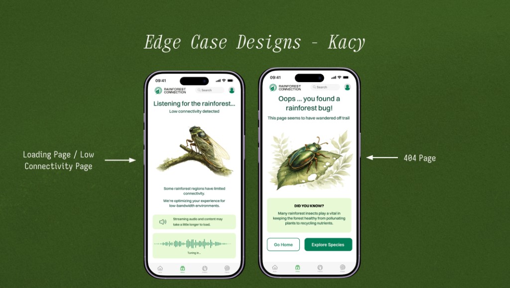
Edge cases that keep the mission visible
Happy-path screens only tell part of the story for an Android app meant to travel with listeners in uneven connectivity. I designed low-bandwidth and error states so a dropped stream or missing page still felt like RFCx, not a generic spinner.
The low-connectivity screen names what is happening (“Listening for the rainforest…”), sets expectations for slower loads, and keeps the listening metaphor alive with a tuning waveform. The 404 turns a dead end into a small lesson: rainforest insect facts, playful copy (“you found a rainforest bug”), and clear paths back to Home or species discovery. Both screens reuse the same header and bottom navigation so users never feel stranded outside the product.
Impact
- Named a product direction when the brief still felt like fog
- Stayed in the uncomfortable conversations until tech, comms, and leadership matched
- Built an IA that scales from awareness to action without gimmicks
- Delivered final hi-fi screens and specs so engineering could implement without guessing intent
Reflection
I walked away remembering that the hardest design work often happens before the prettiest frame. So much of this quarter was translation. Turning vague instinct into language stakeholders could repeat. Holding disagreement long enough for it to become alignment instead of a polite stalemate.
I trust myself more now in ambiguous spaces. I also see how product design quietly decides what power a tool is allowed to have in someone's life. RFCx reminded me that interfaces are never neutral when communities and habitats sit on the other side of the glass.
Final hi-fi screens
The hi-fi work is a set of static frames across Home, Library, Projects, and Engage. They cover onboarding, the storytelling layer, and how podcasts and the marketplace sit together once the system finally felt coherent.
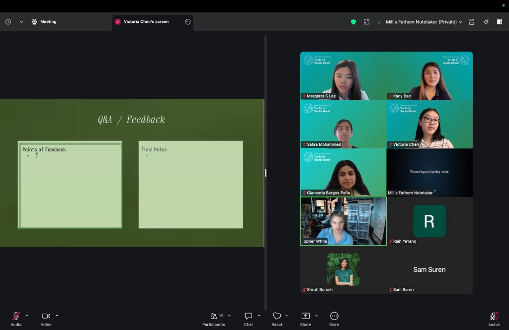
Founder feedback
Before handoff we presented the full direction in a live Q&A with Topher White, RFCx's founder, and Jon Bruno, the CEO. Topher had pushed early for Indigenous marketplace visibility and a platform worthy of field work; seeing edge cases and core flows together helped him connect the vision to what engineering would actually ship. Both leaders were enthusiastic about the direction and the level of craft. The designs are now with RFCx's tech team to implement.