Overview
Callisto is a nonprofit that provides an encrypted platform, Callisto Vault, where survivors of sexual assault can securely record incidents, create timestamped logs, and anonymously match with others harmed by the same perpetrator. By enabling safe matching, Callisto helps identify serial perpetrators while reducing barriers to reporting.
As a product designer on the Tech For Social Good team, I worked on redesigning Callisto Vault's desktop experience with a mobile-first mindset, ensuring survivors could safely, intuitively, and discreetly use the platform on their devices. Our goal was not just usability, but trust, emotional safety, and reduced cognitive load for users navigating trauma.
Problem
Although Callisto Vault is a powerful and impactful platform, its existing desktop experience presented several challenges:
- Most users access Callisto on mobile devices, but the desktop site did not translate well to smaller screens
- The interface was text-heavy, increasing cognitive load for users processing trauma
- Critical actions like Quick Exit were hard to find, especially on mobile
- Dashboard content was repetitive and required too many clicks to reach frequently used actions
- Visual and interaction patterns were not standardized, making it harder to scale the product
“How might we redesign Callisto Vault's desktop experience to be mobile-friendly, emotionally safe, and easy to navigate, while preserving privacy and trust for survivors?”
Solution
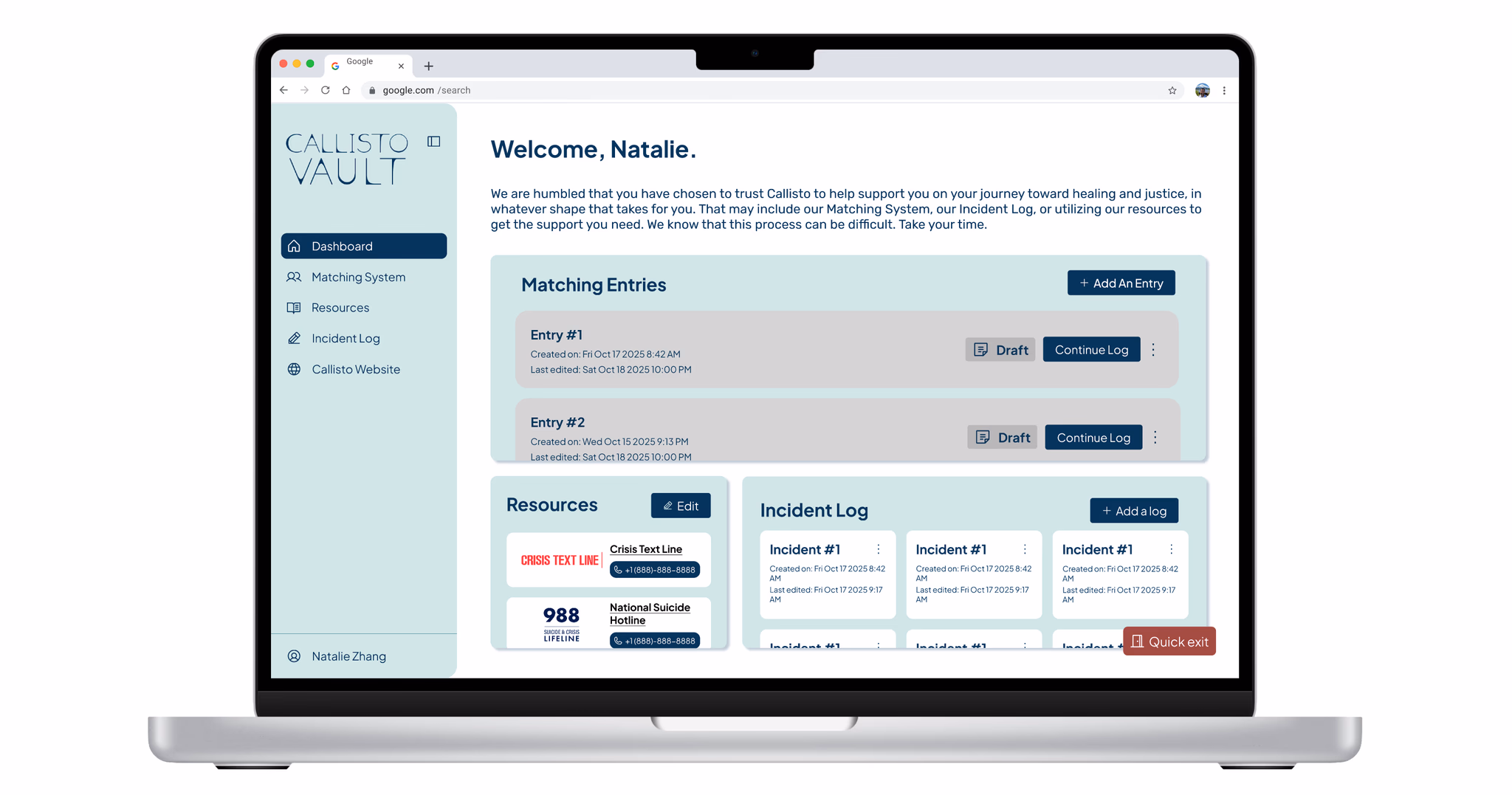
A trauma-informed, mobile-responsive redesign of Callisto Vault that prioritizes safety, clarity, and ease of use.
Key Features
- Simplified Dashboard with reduced cognitive load, reorganized to surface the most important actions without overwhelming users
- Clear separation of Incident Logs vs Matching Logs to prevent confusion
- Improved mobile-first layouts with redesigned headers, spacing, and navigation
- More visible, safer Quick Exit button that's larger, easier to access, and more discreet
- Foundational Design System with consistent components, typography, and layout patterns
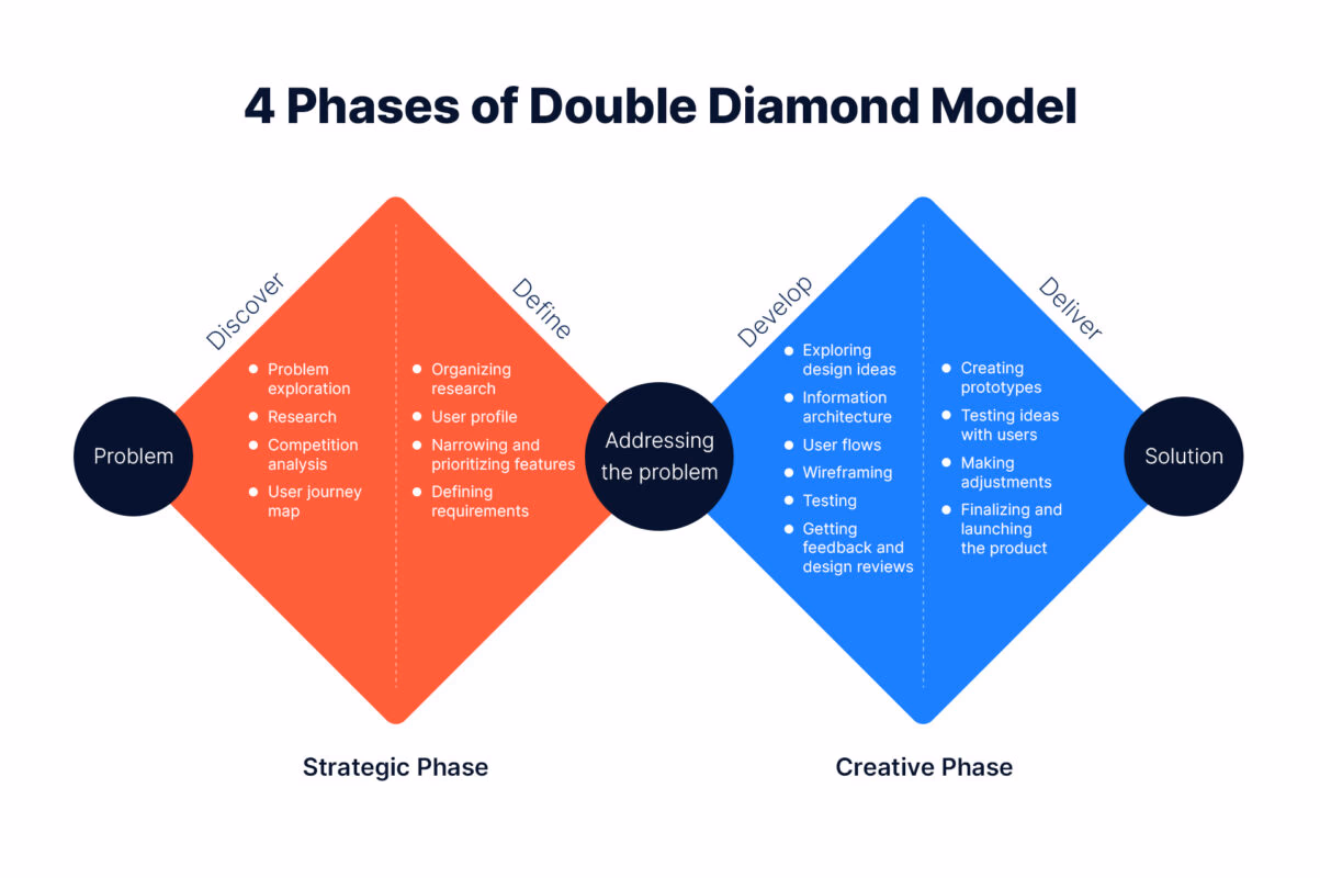
Process
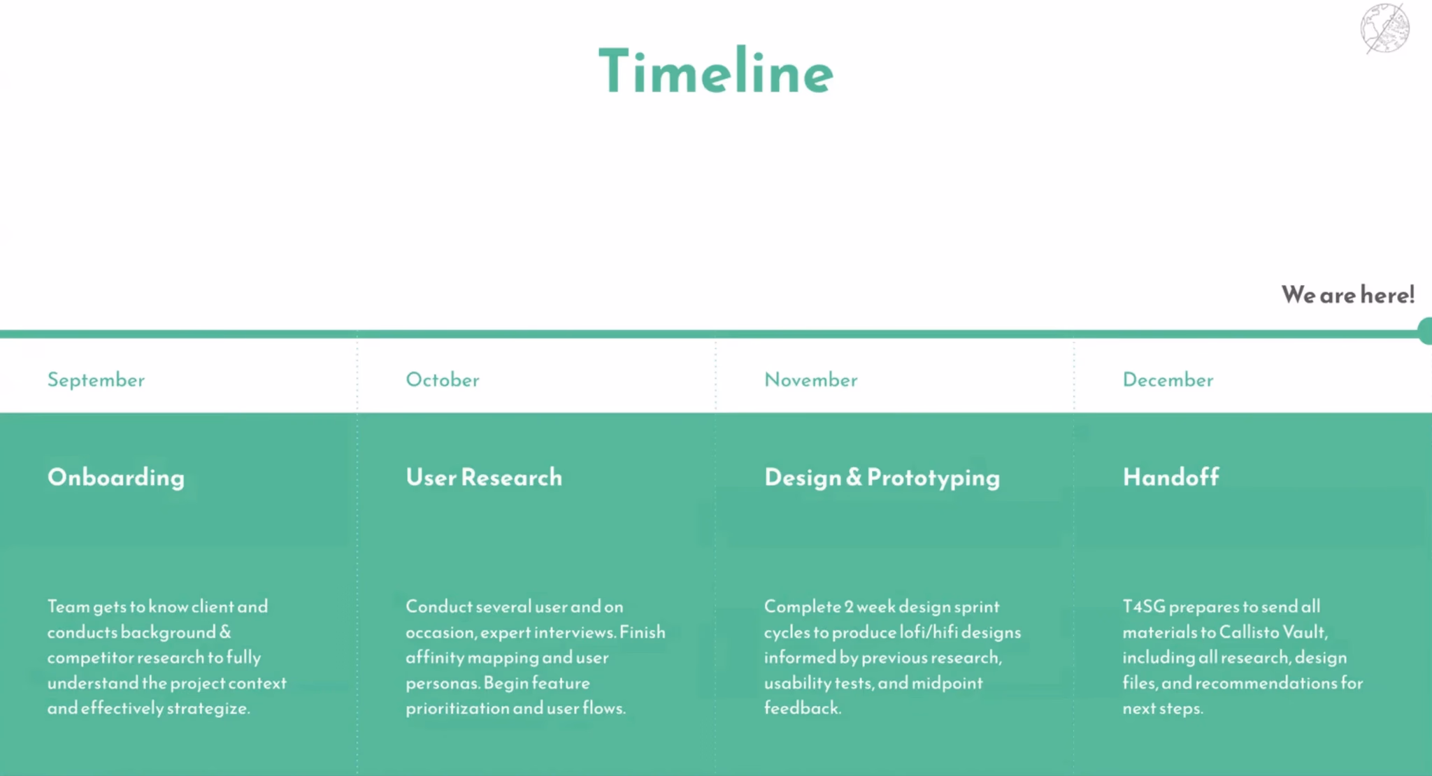
Product Discovery & Research
We began with a Double Diamond approach, starting with broad discovery before narrowing into solutions.
We analyzed platforms including:
- Authy
- Google Drive
- DoD Safe Helpline
- Planned Parenthood
- Spotify
- Overleaf
From this, we identified best practices around:
- Privacy-first layouts
- Clear information hierarchy
- Consistent desktop-to-mobile experiences
- Minimalist design to reduce cognitive strain
User Research
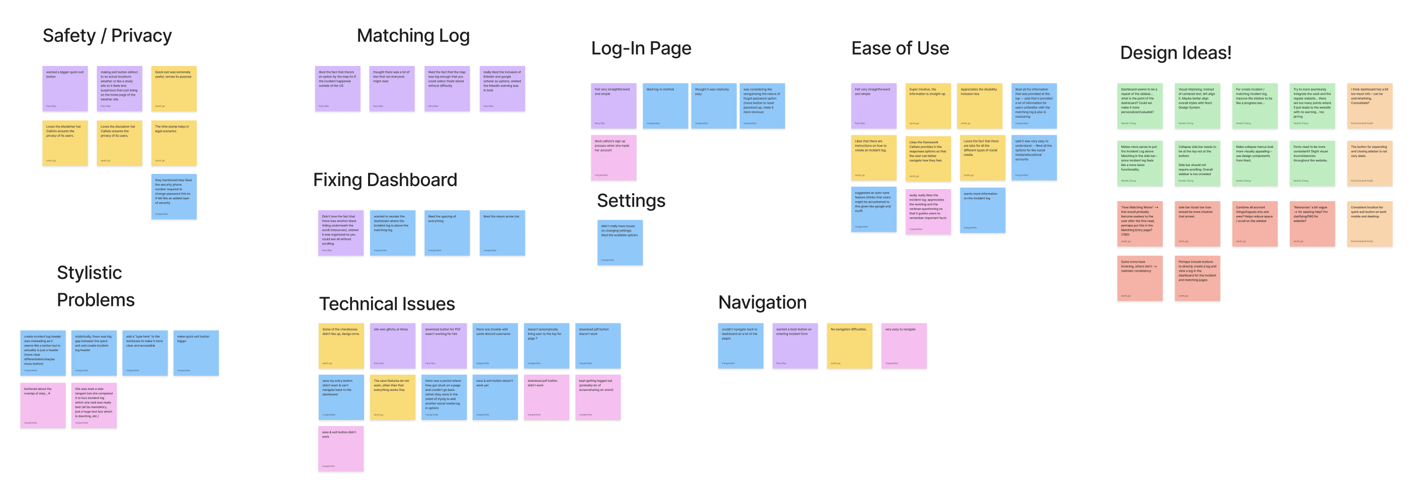
We conducted 4 in-depth interviews with Callisto Ambassadors to understand user needs, emotional context, and trust behaviors.
What worked:Users trusted Callisto's encryption and safety measures. The platform structure felt logical and intentional. Survivors felt safe sharing sensitive information.
Pain points: Mobile headers felt disorganized. Dashboard repeated sidebar content. Some actions required too many steps. Users wanted information presented in ways that matched their emotional bandwidth.
A key insight was that survivors process information differently. Some want to read everything. Others want minimal input and maximum clarity.
“How might we design a flexible interface that supports both highly detail-oriented users and users experiencing cognitive overload, without sacrificing safety or clarity?”
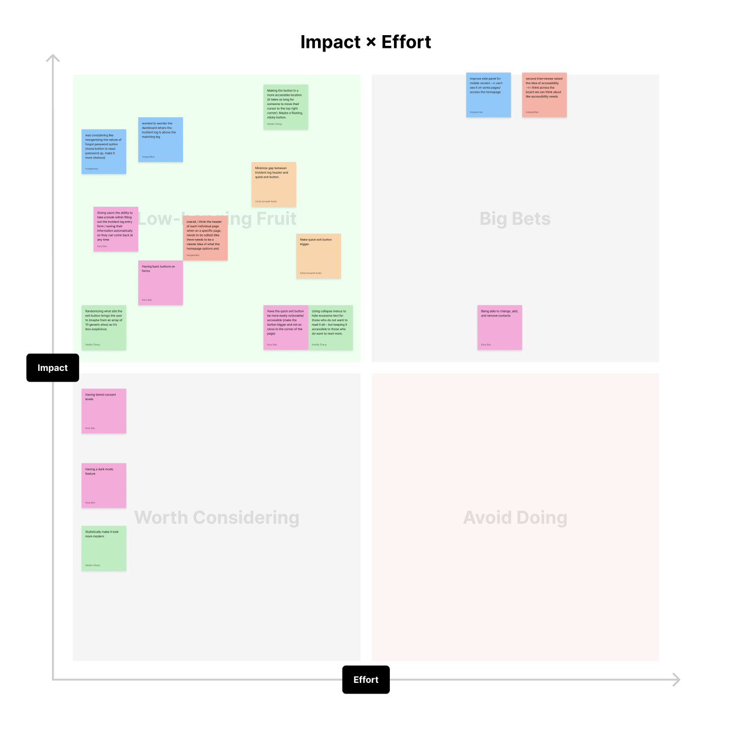
Design Iterations
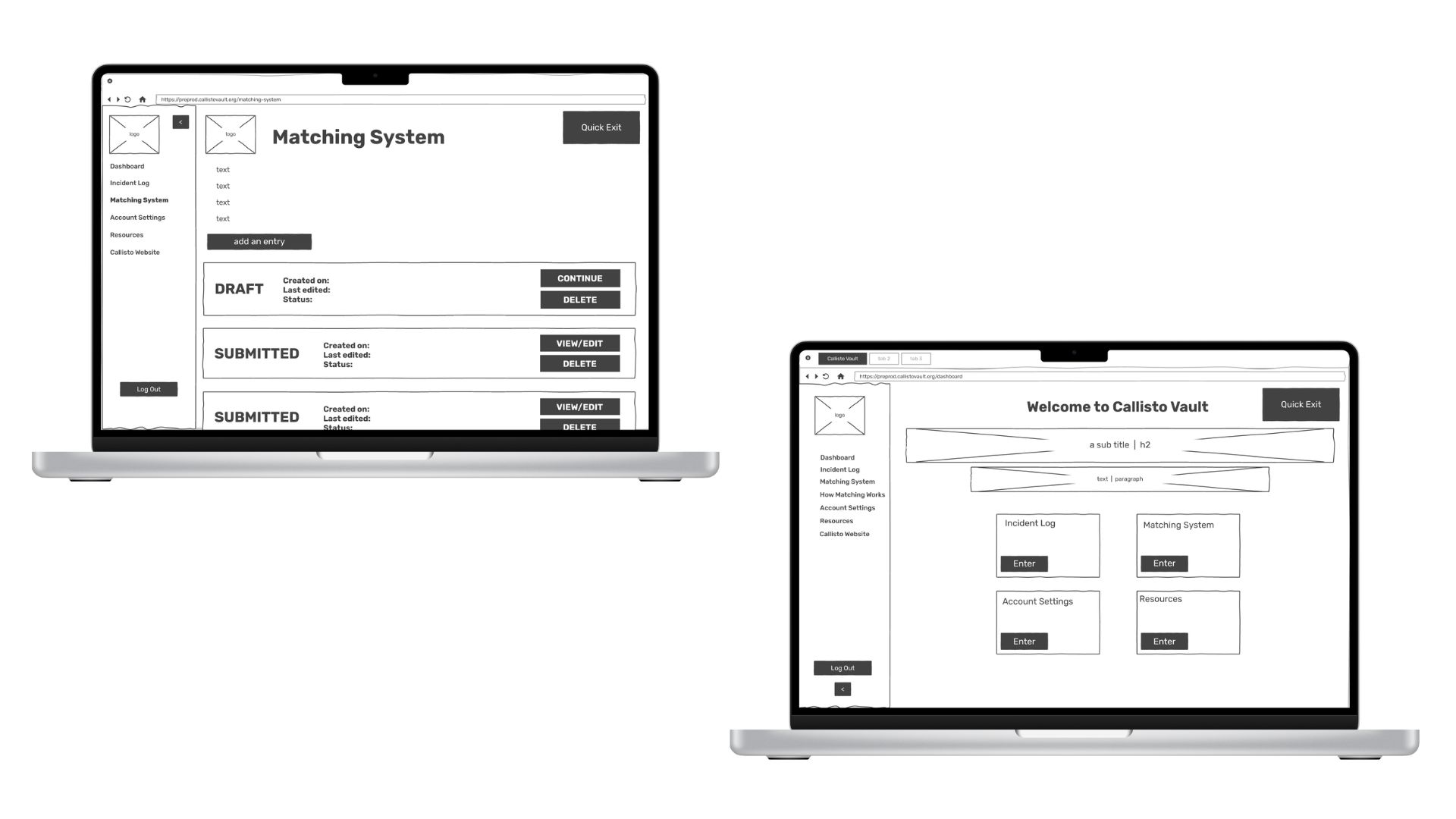
Low-Fidelity
We started with rapid low-fidelity wireframes in FigJam, focusing on navigation clarity, information hierarchy, mobile responsiveness, and reducing unnecessary text. We explored multiple dashboard layouts before settling on one that minimized scrolling and surfaced the most-used actions.
Mid-Fidelity
In mid-fidelity designs, we refined spacing and alignment, tested clearer visual separation between logs, improved accessibility of key actions, and iterated on Quick Exit placement and visibility. Feedback from senior designers and Callisto's lead engineer guided these refinements.
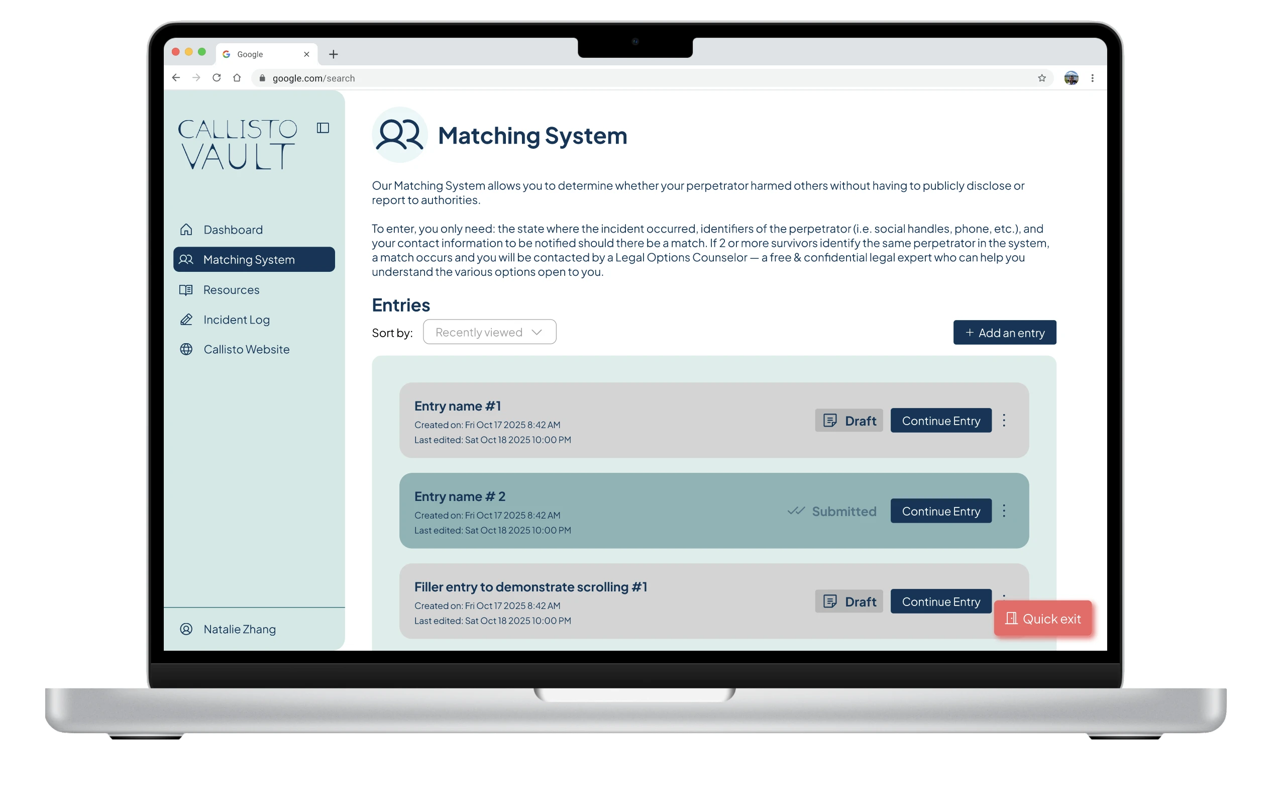
High-Fidelity & Prototyping
In the final phase, we applied Callisto's brand system, built clickable prototypes in Figma, standardized components for future scalability, and ensured consistency across desktop and mobile breakpoints. We focused heavily on emotional safety, making sure nothing felt abrupt, overwhelming, or confusing.
Final Outcomes
- A clearer, calmer dashboard experience
- Improved mobile usability
- Reduced cognitive load through better hierarchy
- Stronger visual consistency across the platform
- A scalable design system for Callisto's future growth
Our work was handed off to Callisto for integration into the Vault system.
Takeaways
- Trauma-informed design requires restraint. Designing for survivors isn't about adding features, it's about knowing when not to add them
- Trust is built through clarity. Clear labels, predictable navigation, and consistent layouts directly contribute to user trust
- Designing for extremes improves design for everyone. Balancing the needs of users who want full context with those who want minimal interaction led to a more flexible, human-centered product